

Designing a color theme for your home, brand, or any creative project can significantly impact its visual appeal and effectiveness. Whether you’re updating your living space or creating a brand identity, it’s crucial to follow certain precautions to ensure your color theme is both aesthetically pleasing and functional. I’ve used Canva for reference in creating my color theme designs, and you can check out my designs for inspiration at the end of this blog.
1. Understand Color Theory
a. Color Harmony:
- Complementary Colors: Choose colors opposite each other on the color wheel to create vibrant contrasts.
- Analogous Colors: Select colors next to each other on the wheel for a harmonious look.
- Triadic Colors: Use three colors evenly spaced around the wheel for a balanced, vibrant design.
b. Psychological Impact:
- Warm Colors: Reds, oranges, and yellows evoke warmth and energy but can be overwhelming if overused.
- Cool Colors: Blues, greens, and purples create a calming effect and are ideal for relaxing spaces.
- Neutral Colors: Blacks, whites, and grays provide balance and can act as a backdrop for more vivid colors.
2. Consider the Purpose and Space

a. Purpose of the Space:
- Living Rooms: Use inviting and comforting colors to create a welcoming atmosphere.
- Offices: Opt for colors that enhance productivity and focus, such as blues and greens.
- Bedrooms: Choose soothing and restful colors to promote relaxation and sleep.
b. Size and Lighting:
- Small Spaces: Light colors can make a room feel larger and more open.
- Large Spaces: Darker colors can make a space feel cozier and more intimate.
- Lighting Conditions: Test how colors look in different lighting conditions—natural, artificial, and at various times of the day.
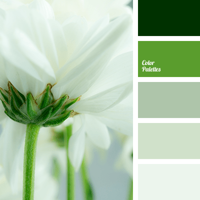
3. Create a Cohesive Palette
a. Limit the Number of Colors:
- Main Colors: Choose 2-3 primary colors for the main theme.
- Accent Colors: Add 1-2 accent colors to highlight features and add interest.
- Neutral Tones: Incorporate neutrals to balance and unify the palette.
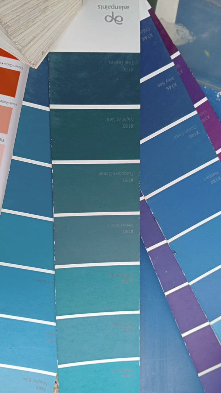
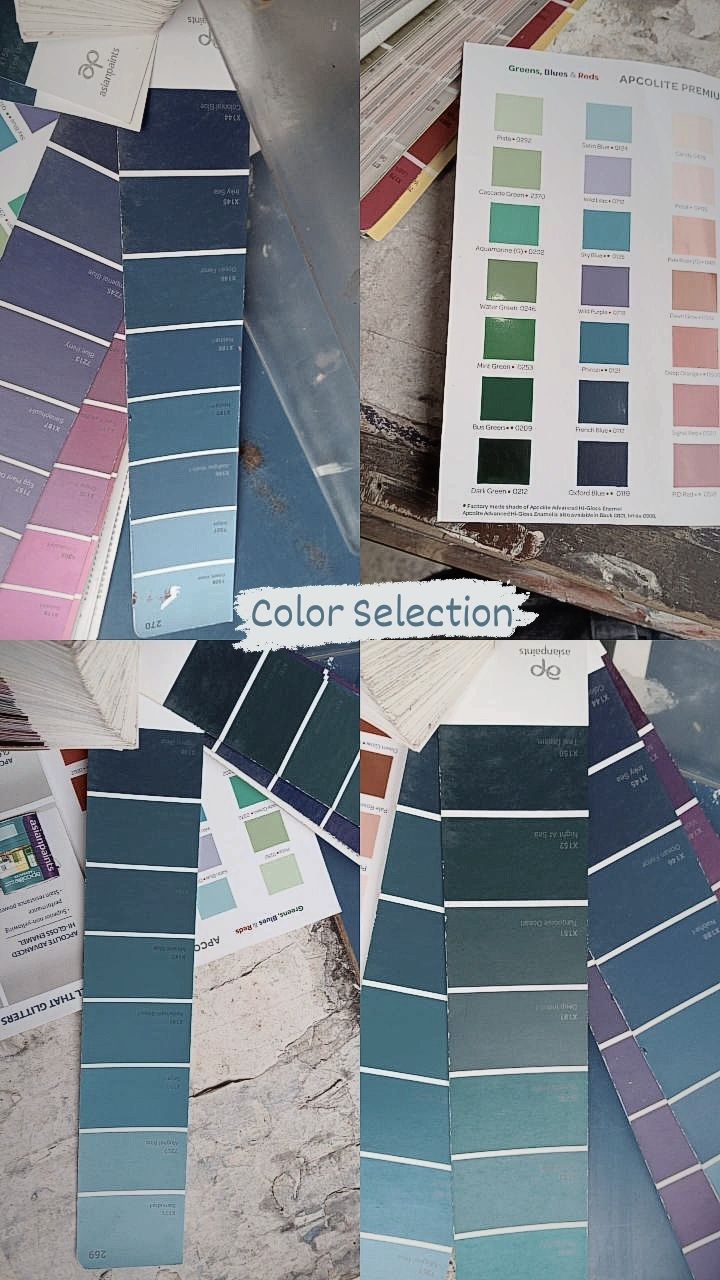
b. Use Tools for Color Selection:
- Canva: I’ve used Canva for designing my color themes, and it provides excellent tools for creating and visualizing color palettes.
- Color Wheel: Utilize online color wheels or palette generators to find complementary or harmonious colors.
4. Test and Evaluate
a. Create Samples:
- Mockups: Use Canva or similar tools to create digital mockups of your color scheme in various settings.
- Swatches: Paint small areas or use color swatches to see how colors interact in real-life spaces.
b. Gather Feedback:
- Seek Opinions: Ask friends, family, or colleagues for their input on your color choices.
- Consider User Experience: Ensure the colors work well together and are visually accessible to all users.
5. Pay Attention to Color Balance
a. Proportions:
- 60-30-10 Rule: Use 60% of the dominant color, 30% of a secondary color, and 10% of an accent color for a balanced look.
- Visual Weight: Distribute colors in a way that balances the visual weight and prevents any one color from overwhelming the others.
b. Adjust and Refine:
- Fine-Tuning: Make adjustments based on how the colors look together and ensure they align with your vision and goals.
- Consistency: Maintain consistency in your color theme across all elements of the design.
6. Finalize and Implement
a. Document Your Palette:
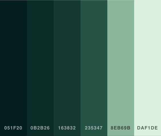
- Color Codes: Keep track of color codes (HEX, RGB) for consistency in various applications.
- Style Guide: Create a style guide or reference document outlining your color theme for future use.
b. Implement Gradually:
- Start Small: Begin with small areas or elements and gradually incorporate the color theme throughout the space or project.
- Review and Adjust: Continuously review the implementation and make necessary adjustments for a cohesive final result.
Check Out My Designs
I’ve used Canva to design and visualize my color themes, ensuring that they are both beautiful and functional. Feel free to check out my designs for inspiration and see how you can apply these precautions to your own projects. You can view my designs here.
By following these precautions, you can create a well-thought-out color theme that enhances the aesthetic and functionality of your space or project. Proper planning and consideration will help you achieve a cohesive and visually appealing result.

You must be logged in to post a comment.